[Interior Design Color Trend] Welcome the New Year! Get a new look with Pantone’s 2022 representative color “Periwinkle Blue Very Peri”!

Under the spotlight! The color authority Pantone's 2022 representative color of the year is officially released. It is a fusion of calm blue and passionate red. Periwinkle blue Very Peri stimulates creativity and creativity from an inspiring perspective, responding to the annual color selection. The space can also be given a new look by balancing cold and warm textures, integrating green tones, matching classic neutral tones, and bright colors to welcome a year full of vitality and hope in 2022!

▲Villa in Ibiza Design: Reutov Design Photograph: Reutov Dmitry 、 Design: Pantone

Respond to the Color of the Year selection by:


1. Balance cold and warm tones to inject vitality into the space

Choose a cold/warm tone according to the theme, and use complementary tones for the auxiliary colors. The natural balance of one cold and one warm makes the Very Peri color matching effect more lively and creates a balanced cold and warm texture, forming a strong visual experience and profound feelings. impression.

▲Villa in Ibiza Design: Reutov Design Photograph: Reutov Dmitry

 2. Integrate green tones to connect with nature


Green is the most important color that depicts nature! It is a color that can arouse people's vitality, bring hope, and relax. It echoes with green, creating a soothing atmosphere in the space, and deepening the connection with nature!

▲Villa in Ibiza Design: Reutov Design Photograph: Reutov Dmitry

▲Villa in Ibiza Design: Reutov Design Photograph: Reutov Dmitry

3. Pair with classic neutral tones to create an elegant atmosphere


The neutral colors dominated by nature, combined with Very Peri colors and natural wood tones, form a visual rhythm that is just right, creating a calm and relaxing environment, showing its elegant and fashionable atmosphere.

▲Kruzhok Cafe Designer Katy Pyatitskaya Photography: Inna Kablukova

▲Kruzhok Cafe Designer Katy Pyatitskaya Photography: Inna Kablukova

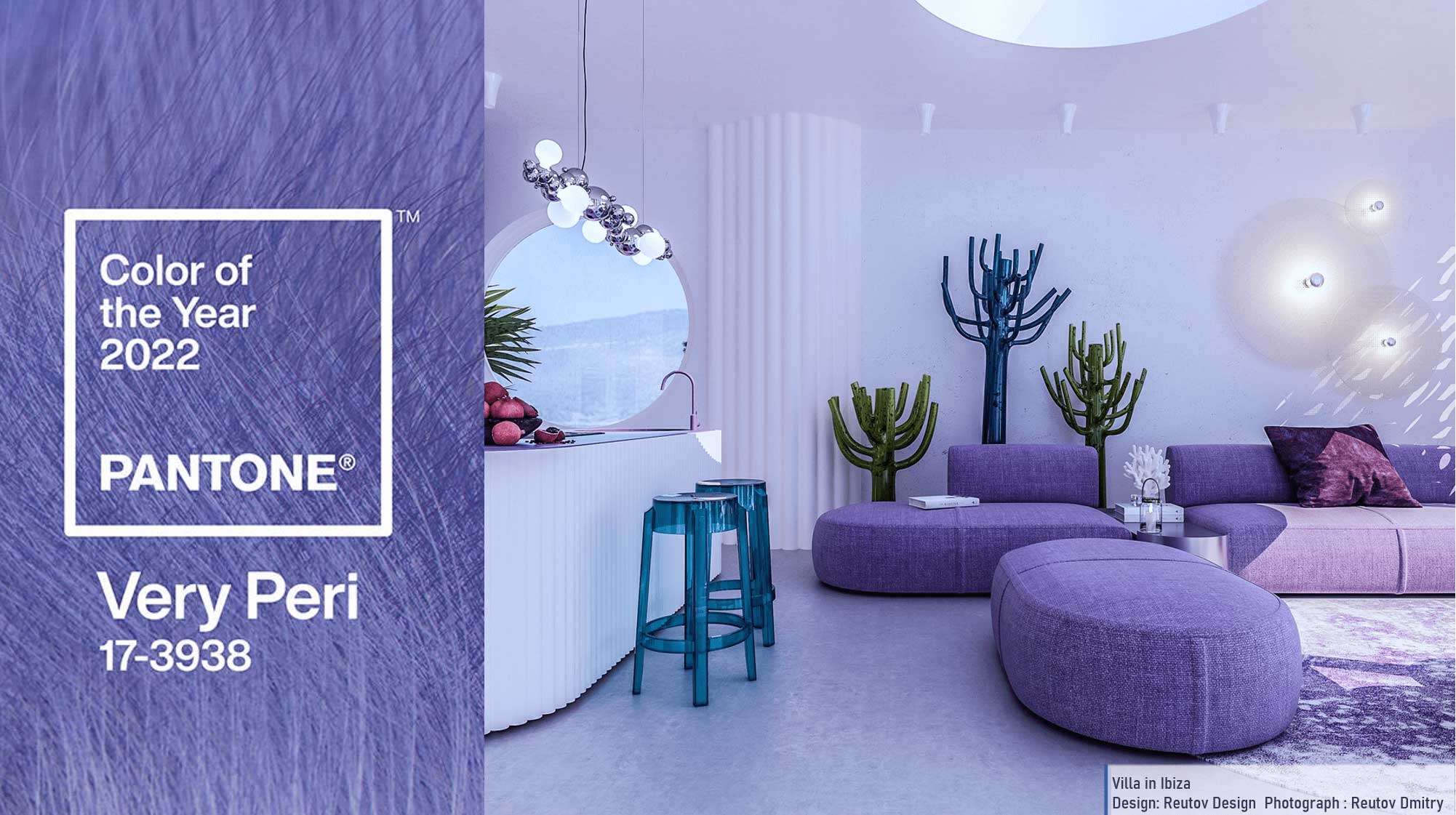
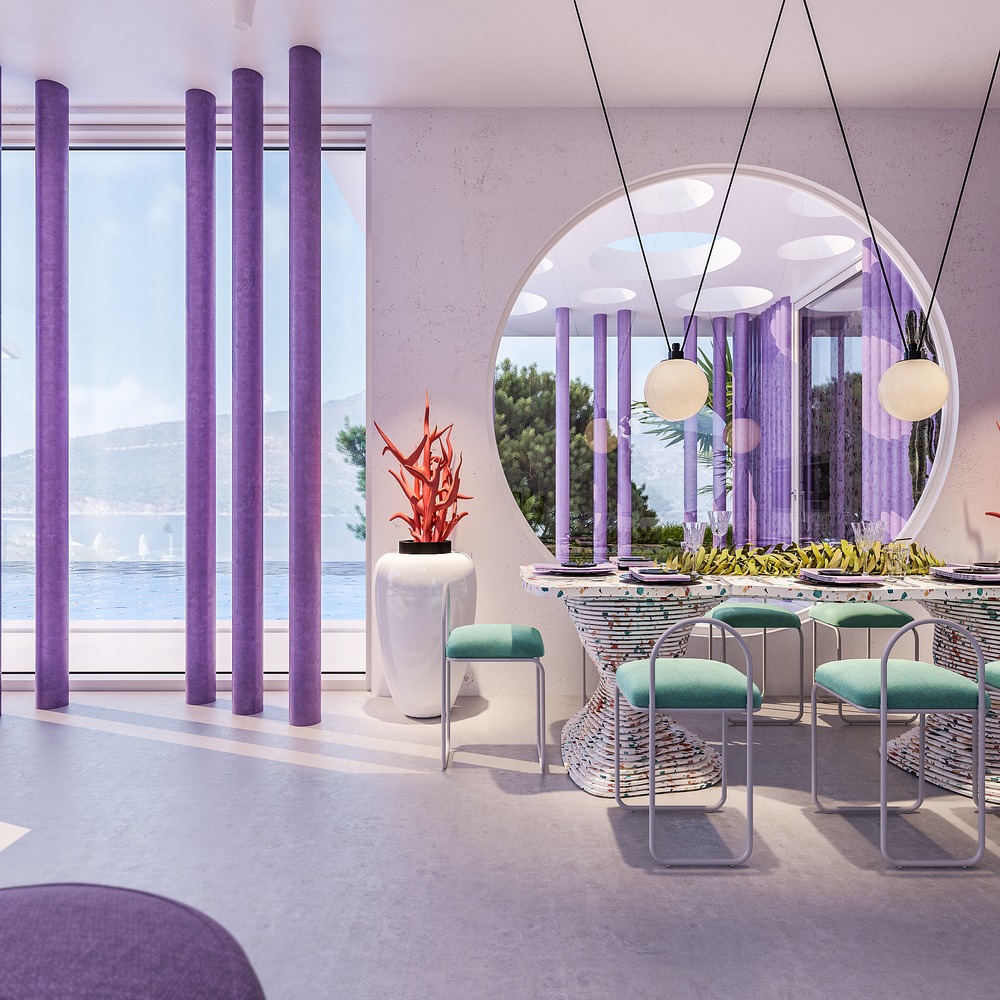
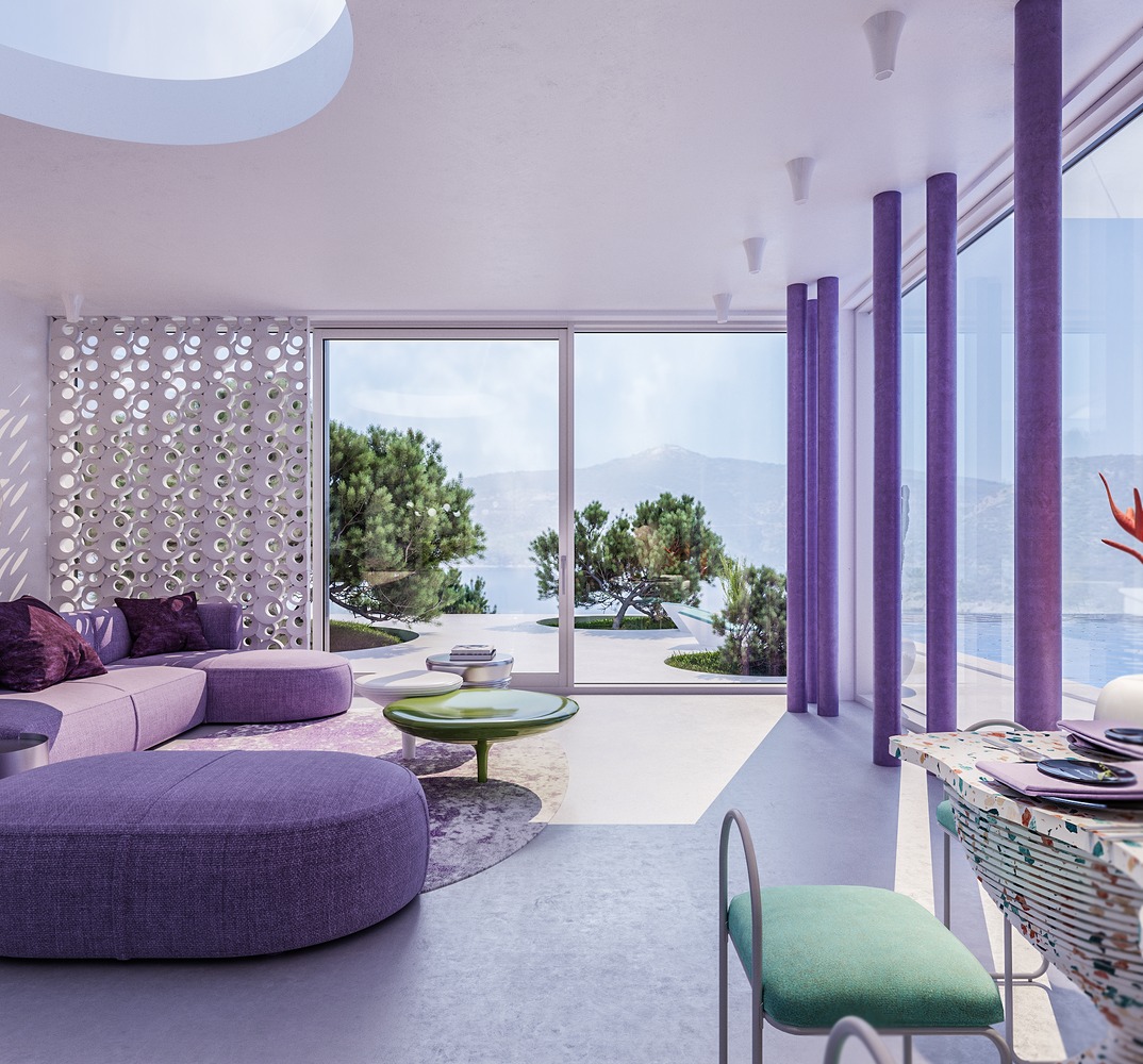
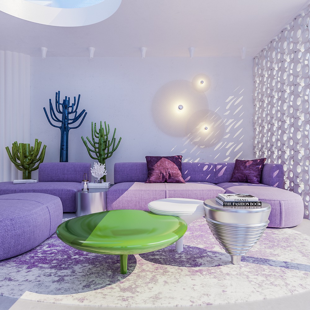
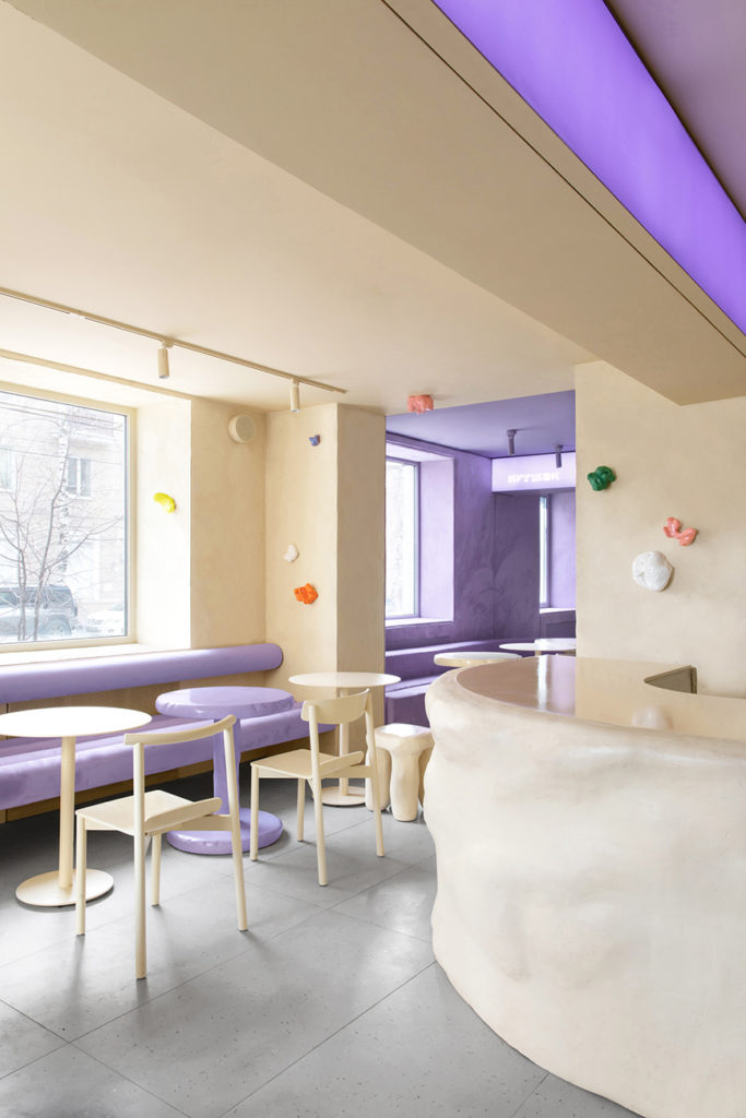
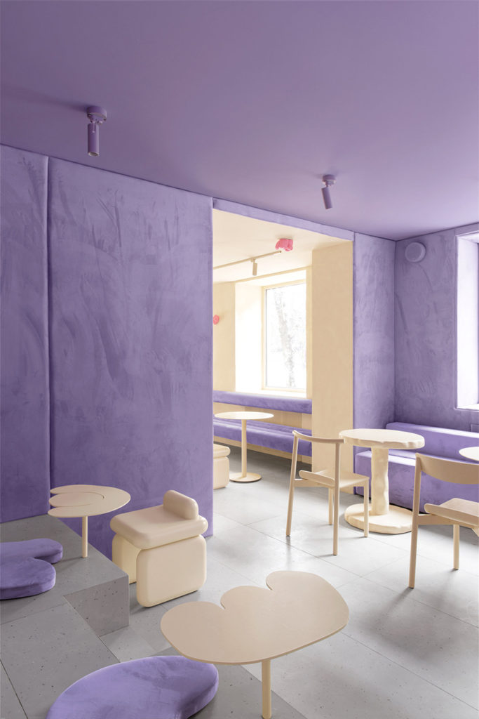
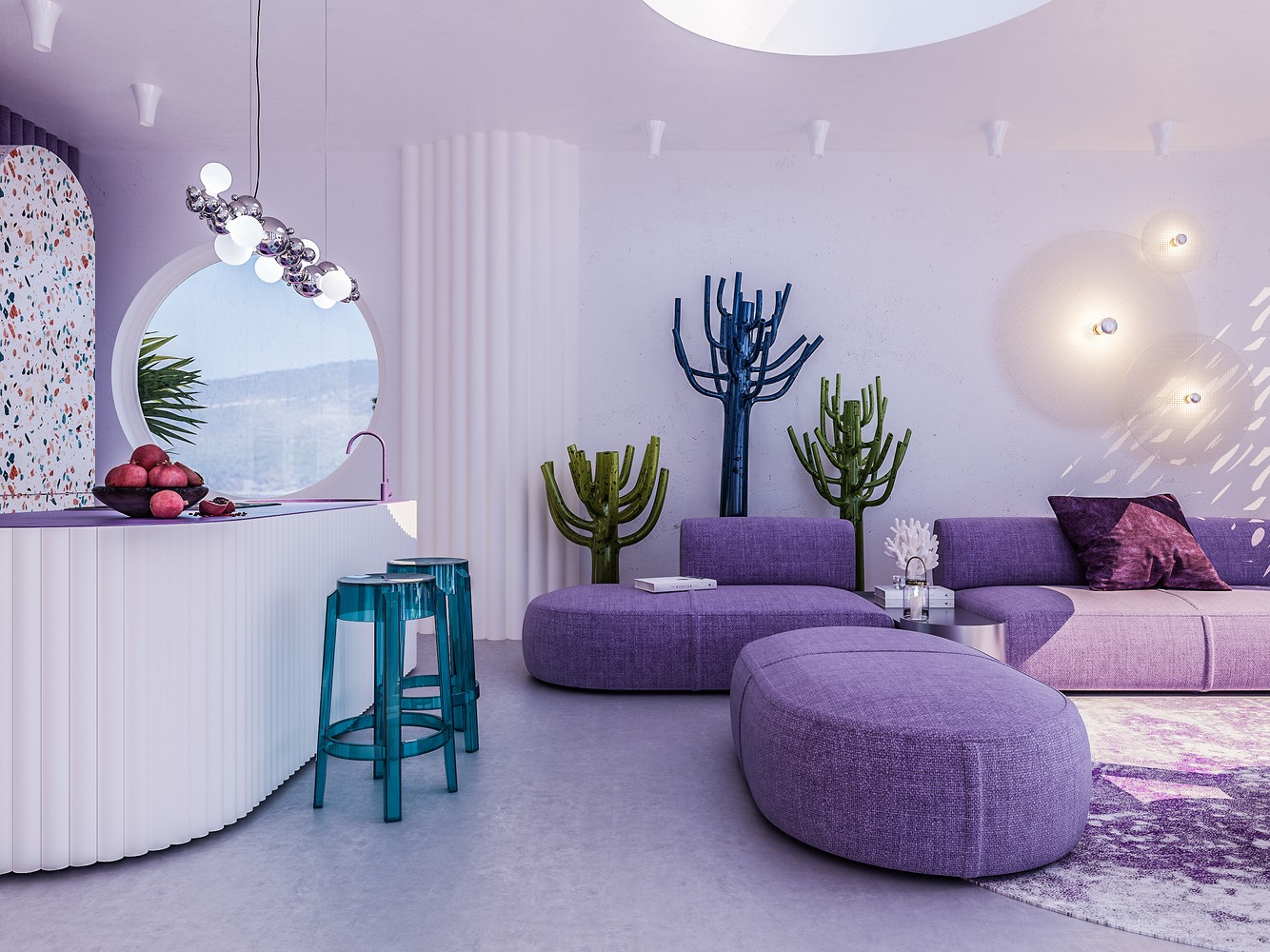
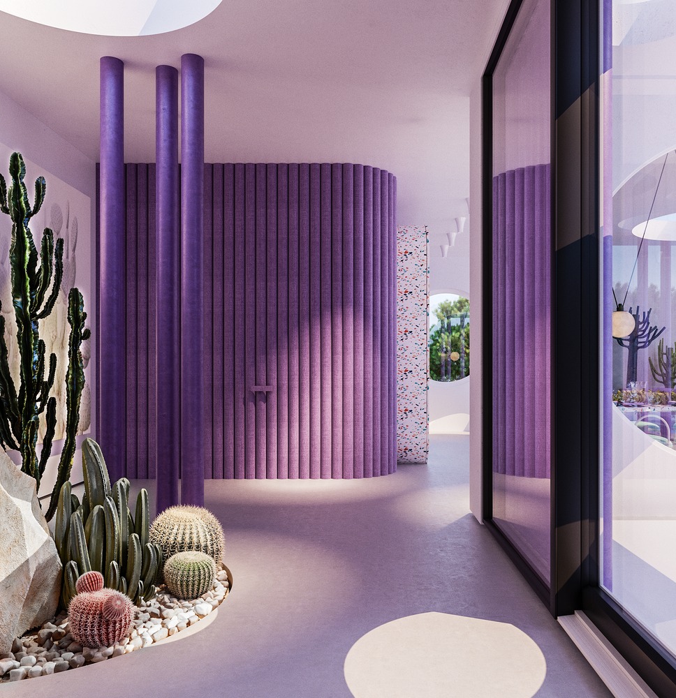
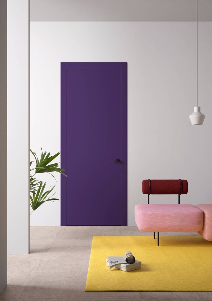
4. Bright colors light up joy and creativity


The bright pop color of Pantone Very Peri, described as a vibrant purple-blue, completely changes the monotony of monochrome and can add a lot of personality to the space. When used in home spaces, it can be embellished with colorful high-brightness colors , bringing bright layers to the space and a completely different joyful atmosphere, increasing creativity!

▲Villa in Ibiza Design: Reutov Design Photograph: Reutov Dmitry

▲Villa in Ibiza Design: Reutov Design Photograph: Reutov Dmitry

▲ALBED Design: Delmonte su ARCHIPRODUCTS Photograph: archiproducts.com

B-STUDIO is good at simple design. If you have any architectural or interior design needs, please feel free to contact us.:B-Studio online consultation

interior space-Avenue of Stars➦ 

construction space-Qing Shui Fu ➦